
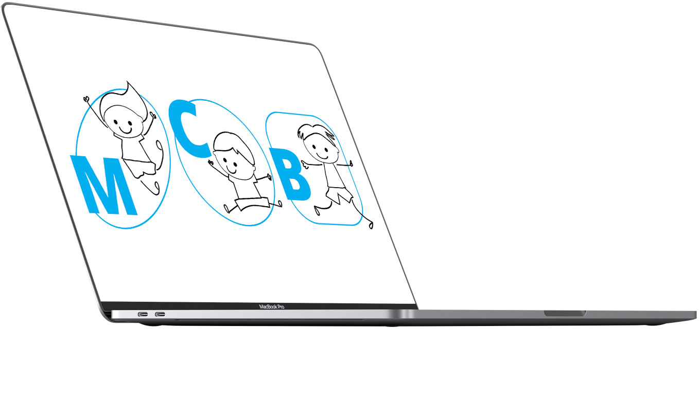
Fritidsinstitutionen ved Blågårdsskolen wanted a logo that corresponded with their company values.
Like the design of the values, the logo is held in few colours so the imagination of the viewer can fill in the blanks (see the values here).
The forms in the logo is collected from the baseform in the values.
The club is located at three different addresses. Each of the adresses got there own logo, in order to separate them if needed (e.g. in a soccer tournament between the three).